Our final and most detailed project in my intro to Auto Cad class was a drawing of the San Francisco Federal Building. We drew the outline of the building first by tracing a series of PDF drawings we were given to be used as templates. We placed these templates into the AutoCad file – one for the plan drawing, one for the north/south elevation, and one for the east/west elevation. After drawing the outline of the plan and elevations we extruded the two dimensional drawings to form the high rise, the crenulated roof, the slanted columns, and windows.
For each of the Auto Cad projects we created a final layout showcasing our drawings and wrote a short summary detailing the history and notable design elements of each building or furniture design.
For this assignment we first drew the floor plan, then extruded it to create the columns and walls, and finally added the butterfly roof and windows. Through this process I learned the 3-D drawing commands and gained a better understanding of architectural design elements and how a drawing of a building plan translates into a three dimensional creation. In addition to the butterfly roof, the vertical slit windows and the open airy floor plan are key design elements that make this architect’s work so remarkable.
For each furniture assignment, we were required to create three two-dimensional orthogonal furniture drawings in drafting and annotation mode. This included drawings of the front, top, and side view of each design. Then we created three-dimensional drawings by extruding the orthogonal drawings.
Each layout includes the three orthogonal views, a photo of the design, and a short summary of the design history obtained through my own online research.
Barcelona Pavillion. 18″ x 24″ Colored Pencil on copy paper. For this project I used photos I found online as templates and traced the outline of the buildings, and then drew in more details by hand. After rendering each drawing in colored pencil, I scanned and uploaded them into Photoshop where I put the final layout together.
The following renderings are selections from class assignments. Students were given a xeroxed drawing by the instructor and required to render it in color, adding shadows and other details.
Complementary green and purple in muted intensities offer up a tranquil feeling reminiscent of a walk through a cool forest on an early spring morning. The natural looking pebble tiles have just a faint hint of color in low intensity greens tints similar to moss or sea water. A canvas upholstery fabric in a darker shade of green was chosen as the secondary color which brings out the subtle variances in shades of the pebble tiles.
A cream color was chosen as the dominant color. Its neutral hue creates a pleasing background allowing the green and purple hues to stand out. It is slightly on the warm side bringing out the gold streaks seen on some of the pebbles. Finally, an accent in a deep, rich purple was added as a paint color. It matches the dark, rich purple stone in the set of pebbles and suggests royalty and riches as well as bringing to mind the color of the sky right before sunrise.
This color scheme would be perfect for a high-end spa where clients would be invited to relax and to be treated like royalty in an setting evoking the calming effects of nature.
Residential Floor Plan
I designed this floor plan for a two-story home suitable for a small family of four. The top drawing is the upper level, and the bottom drawing is the lower level. The main entrance (bottom drawing, top left) opens into a small foyer at the foot of the stairs and leads into the living and dining area. Next to the foyer (upper left corner) is a small reading nook next to two windows which allow in ample natural light. It is separated from the front entrance with a short wall to minimize disruptions from people coming in and out of the house. Below the reading nook is the living room which contains a large sectional sofa roomy enough for the whole family to relax on, and space for a TV on the wall directly across from it.
Between the living room and reading nook is a fireplace in a centrally located position so that it can be viewed from multiple areas in the house and allow heat to travel efficiently throughout. The dining table is situated in a nook extending out from the south facade of the house and has large south-facing windows, and doors that open out onto the patio. Next to the dining area is the kitchen which has an island with bar stools for casual dining.
Scale 1 1/4″ : 1′
Residential Interior Design Floor Plan
The master bedroom is accessed just to the left of the kitchen. Across from the bed are french doors with glass inlays which open up onto the patio creating a line of sight from the bed to the outdoor fireplace. Between the bedroom and the bathroom is a long walk in closet with “his and hers” sides and a window at the end to allow in natural light. Placing the closet between the bedroom and bathroom is an ideal way to add privacy between the two rooms.
The bathroom has a large floor length window behind the bathtub which looks out onto a woodsy setting. There is a sliding pocket door between the bedroom and bathroom, the kitchen and bedroom, and the bathroom and laundry room. The multiple entrances allow the bathroom to be accessed by guests without them having to walk through the bedroom.
Conveniently located next to the kitchen and bathroom is the laundry, also featuring a large utility sink for dog washing and other chores. To the left of the laundry room is a mud room – an essential feature designating a space to hang coats and keep shoes out of sight.
The upper level has a large loft space suitable for older children to share. On the right is a guest suite that can also be used as an office, and a bathroom for the children and guests. The upstairs bathroom is directly atop the downstairs bathroom which makes installing plumbing and water hook-ups more efficient.
Product Photography. Edited in Adobe Lightroom for quality and accuracy.
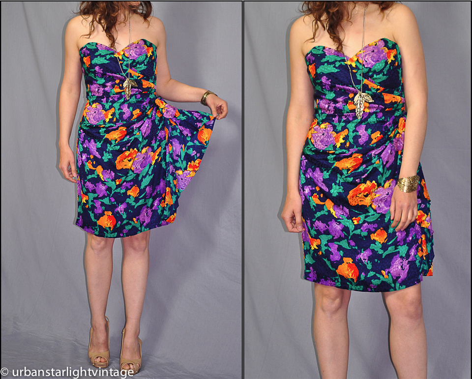
Vintage 1980s I MAGNIN silk jacquard floral dress with ruching on side.Rare vintage Emmanuelle Kanh sunglasses with gold hardware
Travel photography. Moab, UT. July 2014. Edited and enhanced in Adobe Light Room.
Moab, UT. Canyonlands Nat’l Park. July 2014Moab, UT. Arches Nat’l Park. Tourists at Delicate Arch at Sunset. July 2014.Moab, UT. Old historic church house. July 2014.Moab, UT. Moab Under Canvas. July 2014
Portrait I created in Adobe Illustrator using a photo as a template. Mar 2011.
Design proposal for 2018 Olympics created in Adobe Illustrator using a photo as a template. Apr 2011.
Goddess
36″ x 36″ x 8″ approx. Papier machė, copper wire, tape. April, 2011. The body was formed by molding the papier machė around a mannequin, then cutting it off and patching it up with more papier machė. The face was formed in a similar fashion, using a Styrofoam mannequin head as a mold. The wings and hair were sculpted out of copper wire.
This piece has a lot of movement. It was designed so that the head is loose and can move subtly. In the photos she appears to have some noticeable variances in facial expressions that are seen with different camera angles and lighting.
Cardboard Dress
4′ x 1′ x 8′ approx. Corrugated cardboard, copper wire. Feb 2011. Inspired by the art dress installation on The Magnificent Mile in Chicago in 2008.
Designed roughly according to my own measurements. I took measurements of myself and used them to form the symmetrical pieces that make up the bodice. I pierced tiny holes in the corners of the cardboard pieces and then threaded short pieces of wire through the holes to connect the cardboard pieces and twisted the wire together to create a barbed look.
The skirt was created by scoring strips of cardboard and folding them back and forth creating a zig-zag effect. The strips were then attached loosely around the bottom of the bodice so they have some movement. The design is intentionally colorless, using brown and copper to create a more raw look.
The Eames house, designed by iconic husband and wife design duo, Charles and Ray Eames, during the peak of modernism in 1949, is a reflection of the Eameses’ proclivity for streamlined designs and use of prefabricated materials such as plywood and steel. Charles’ close friend and colleague, John Entenza, the editor of California Arts and Architecture, had purchased a three acre parcel of land in the Pacific Palisades, seated atop a 150 foot high cliff overlooking the pacific ocean. The acreage was intended as the site for both the Entenza and Eames houses, which were to be part of the case study series that Entenza was putting together to showcase a collection of homes designed to promote the ideals of a post-war modernist design aesthetic and philosophy.
Charles & Ray Eames at WorkView From Site of Eames House Overlooking the Pacific Ocean in the Pacific Palisades
Identification of Place and Basic Elements
The Eames house was designed as a space for a husband and wife team sharing similar interests to both live and work. The need for a separate work space inspired the construction of two separate buildings on the site. The slightly larger of the two, located on the south end was designated as a space for living, and a smaller work studio was added on the north side with a courtyard in between visually connecting the two structures. The living portion of the house has a large open space for entertaining, while the work studio includes a darkroom for developing photos, an office, and a design workspace.
Rather than being made up of a series of enclosed cells, as many traditional spaces are, an open floor plan was chosen instead. The basic elements of the house are very simple, utilizing just the platform, barrier, roof, glass wall, and column. The backbone of the two structures is an easy to assemble frame of uncommonly lightweight prefabricated steel beams (four inch “H” columns for the walls, and twelve inch deep, open web joists for the roof), which was erected in a single day. The barriers consist of a series of orthogonal panels – opaque colored panels alternating with translucent and transparent panels. In addition, there is a path leading from the driveway to the main entrance of the living quarters on the ground floor, identifying the one place of entry. The courtyard between the two buildings is a place for growing plants, as well as a pathway to travel to and from the home and office space. Also, there are two balconies, one on the work studio, and one connected to the bedroom which incorporate the platform element. According to the architects, the space was designated as, “a background for life in work” and a place for “relaxation with friend or foe.”
Eames House Ground Floor PlanPath Through Courtyard Between the Two Buildings
Modifying Elements and Elements Doing More Than One Thing
Light, time, and color play a large part in modifying the structure. Though initially appearing to be a simple, unelaborate design, the house actually has many subtle complexities which are heightened by these modifying elements. One of the most fascinating features of the house is the play of light and shadow projected through the windows. The house was designed in such a way that the white opaque wall panels act as a projection screen, and the windows directly opposite, act as a camera, projecting silhouette images of objects such as plants and vases onto the panels. In addition, the composition of the red, white, and blue panels trimmed in black, which make up the exterior facade, strongly resemble a Mondrian painting.
The modifying elements are captured in a film Charles made called, “House After Five Years of Living,” which is a series of photos strung together in a slideshow and set to music.
Modifying Elements – Light and Shadows and FramesModifying Elements – Light and ShadowsMondrian PaintingEames House
Making Frames
Metaphorically speaking, the house frames the lives of the occupants by outlining a specific space for them to live and work. In a literal sense, the large framed glass panels frame the activities of the occupants as potentially viewed by passersby outside the house. The whole house itself could be considered a giant replica of a Mondrian painting framed by the black steel beams. Each individual rectangle is framed in black, as well, and some of these frames contain a series of even smaller frames within. In addition to framing the lives of the occupants, the house is also a frame and backdrop for the Eames collection of objets d’art that fill their home and for their own furniture designs including Eames’s infamous lounge chair.
Outside the walls is an additional frame of Eucalyptus trees, which frame the house on the two elongated sides, creating a strong barrier between the house and the outside world, and add a sense of security and enclosure similar to a fence. Originally planted as a privacy screen between the Entenza and Eames houses they have been modified by time growing into a tall and dense barrier. This barrier of trees could be considered an additional basic element in the design, possibly even more significant than the barriers and columns used to construct the buildings themselves. The eucalyptus trees encircling the Eames home create an even stronger and substantial outline of place than do the glass walls and beams themselves.
Trees Frame Entrance and Small Frames Within Larger FramesHouse Frames Lives of Occupants
Temple Versus Cottage
The original design for the Eames house, called The Bridge House, was intended to extend out at a ninety-degree angle from the hillside and cantilever over the meadow below, with the opposite end supported by two pillars. After visiting a Mies Van de Roh exhibit at MOMA, New York and seeing a design similar to his own, Charles decided to revise his original plans. What resulted from this modification, and became the Eames House as we know it as today, has more characteristics of a cottage than a temple. The house is at ease with the natural world, not trying to rise above it, or separate itself from it. It is built next to an embankment which is integrated into the architecture of the house. This integration into the natural landscape rather than attempting to change the natural characteristics of the site, is a cottage characteristic, whereas the original bridge house design would have been considered a temple the way it was situated above ground in an attempt to defy gravity.
Additionally, the interior resembles that of a cottage rather than a temple. The furniture and the collections of objects and textiles, are arranged with seemingly no symmetry or precise geometric order, yet the eclectic arrangement of various types and styles of objects are artfully and intentionally arranged, everything placed in just the right spot. The architecture of the landscape also has an unplanned element typical of the cottage concept, lacking any certain or calculated layout. While the trees are planted in rows around the outside of the house they are not lined up and spaced at equal intervals, rather they are all different sizes with branches growing at different angles and heights.
Of course, one might say that the Eames house has now become a temple of sorts. Now that the occupants have long passed on, it has become a sort of shrine to mid-century modern design and architecture where design aficionados can pay homage.
Eames House Interior – CottageEucalyptus Trees Lining House
Geometries of Being Versus Ideal Geometry
The geometry of the layout was influenced greatly by the lie of the land on which the house is situated. The embankment on the site, which the house is strongly integrated with, is the main factor in determining the geometry used. As the house was built parallel to the embankment, this allowed only a diagonal line of site towards the ocean, when a more direct view would have been preferred. There was also a direct line of sight towards the Entenza house which brought up issues of privacy. An elongated mound, constructed from the dirt excavated to form the retaining wall, was planted with Eucalyptus trees to form a privacy screen.
While the design does not incorporate the extreme ideal geometry typical of the temple paradigm, there are some characteristics of ideal geometry in the design. For example, the whole structure is a perfect orthogonal shape, with all the walls, the floors, and roofs forming ninety degree angles. The material used for the main frame, steel, was conducive to the box-like shape of the structure, this being an example of geometry of making. The strict, ideal orthogonal shape of the entire structure is counteracted by the surrounding trees and vegetation which create a pleasing contrast between the natural and organic; and the man-made and precise.
Eames House Construction Showing Embankment and Orthogonal Steel Frame
Works Cited
1.Steele, James. Eames House Charles and Ray Eames. London, New York: Phaidon, 2004. Print.
2.Unwin, Simon. Analyzing Architecture. New York: Routledge. Print.
The descriptive details of the Eames house (summarized in my own words) and many of the photos shown here were taken from “Eames House,” the book. My case study was modeled after Unwin’s theories of the basic elements of architecture in “Analysing Architecture.”


")
")
")
")
")
")